Tuesday, December 24, 2013

Merry Christmas and Happy Holidays!


No matter what holiday you celebrate I hope you have a wonderful time with your family and loved ones!

Wednesday, December 18, 2013

My New Favorite Book

I love art books!  I find them so inspiring. This is my newest fav, Print & Pattern Kids.

It is over 300 pages long and it is filled with a variety of artists who license their work. Since I would love to license my art for children's products this is the perfect book for me to study. Here are a few of my favorite pages. The artists' names are on the photos so you can Google them.


I find myself drawn to colorful patterns with cute characters. I like the whimsical style and the hand drawn feel. These artists work on their computers but I don't feel these images have the flat/perfect vector feel. I see a lot of potential with merging my art with the computer. I just have to work on those computer skills!

You can find the book here

You can find the Print & Pattern Blog here. Talk about eye candy!  If you haven't checked it out, you must!


Friday, December 13, 2013

Scenes From the Studio

 A few photos of things going on around my studio. 

How I organize my inks. 

Trying to clean up and clear out. 
 
Art on my table. 


I'm trying to get organized for 2014. I'm going to get my tush in gear this year!

I also have a goal of doing art for 15 minutes every day. A full post about that endeavor coming soon!

Thanks for stopping by!


Sunday, December 8, 2013

Dealing With the "Tough Stuff"

I have been debating all week whether or not to blog about a recent art related experience. I don't want to come across as negative or whiny. But the truth is, my experience is something all artists go through and I feel it's important to share how I am dealing with it and what I've learned so, here it goes.

Last weekend was the Black Friday Chrismtas Sales' Extravaganza that every retail store engaged in. I jumped on board and loaded my shop with affordable originals and I lowered my prices for my prints. I promoted it over the weekend trying to be "just enough" without being annoying. I didn't get a single sale. I was super disappointed. I did get more traffic but no purchases.

When a disappointment like this happens in your life, especially if you are an artist, a lot of negative thoughts start filling your head. Stuff like "your art isn't good enough", "all your friends who've told you your art is good were lying", "there are hundreds of people who are better than you", "maybe you should make jewelry instead" and so on. These thoughts lasted about a day or two and I tried my best to ignore them. They were just a story I was creating in my own head and they aren't the truths I want to believe in.

After a couple days objectivity comes into play. I had thoughts like "you haven't been active with your shop until this past weekend. You need to work on that.", "self promotion isn't your favorite thing to do. Find a more creative way to do it.", "make good art". That last one really stuck with me. There's a great commencement speech from Neil Gaiman called "Make Good Art". And that is what it's all about. During last weekend I had some time to paint and it felt so good and so peaceful. I didn't check Etsy. I didn't have negative thoughts. I was enjoying moving the paint on my surface and drawing with my pencils. I got lost in the art making for a while. It was joyful.

So, I'm moving forward from last weekend. It's okay that I felt disappointment but I don't want to stay in that place. I have to move forward and do what I love doing. I have to learn from the experience. So, I will spend time analyzing and honing my business skills. First and formost I have to make art that I love and not what I think people will love. I have faith my audience will find me and sales will come my way when they are supposed to.

Here are some pieces I've been working on. I just love making critters! Hopefully these guys will be in my shop this week.

Here is the link to the Neil Gaiman speech. It's very inspiring!

If you would like to share how you deal with disappointment, I'd love to hear! Just post a comment below.

Thanks for stopping by!


Wednesday, November 27, 2013

Etsy Sale All Weekend

Black Friday through Sunday Night I am having a sale in my Etsy Shop! I have lowered the prices on all my prints.

8x10's are $15.00 this weekend instead of $20.00


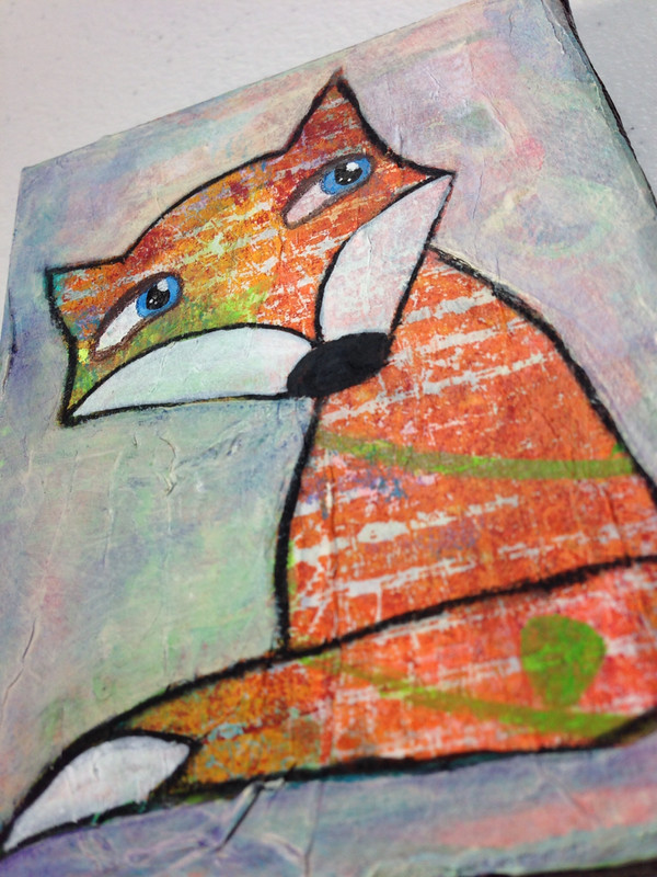
I also have my first originals available in the shop. I did a series of foxes on 4x6 Strathmore Mixed Media Paper. Each fox is different and I varied the mediums used as well.


This weekend only they are $12 each!

 
They are original paintings ready to be matted and framed. This is my first Christmas with a shop so, I thought I'd kick it off with a very fun opportunity to own or give an original piece of art. I love foxes and these were so fun to create. I truly hope they all find good homes!
 
Happy Holidays!
 
Lynda


Etsy Shop Preview for Black Friday

I've got the holiday tunes blaring (Brian Setzer Orchestra Holiday Channel on Pandora) and I'm ready for the holidays to begin.  I decided to have a sale in my Etsy shop starting Friday with specially priced original paintings of foxes.  Here is a sneak peek.  They are 4x6 paintings using various mediums on Strathmore 400 Series Mixed Media Paper and are ready to matted and framed.  These are great for fox fanatics (like me) or a kid's room with a woodland theme.


Other items in my shop will be priced lower this weekend only!  So, check out my shop and see if there are any prints you would like.  These foxes won't be listed until Friday.  I had a great time painting them and I hope they will live happily in someone's home soon.

Have a wonderful Thanksgiving!

P.S. I will be announcing on Instagram, Twitter and my Facebook page when the sale begins.  Check out my links above in my link bar and follow me for updates!

Thursday, November 21, 2013

The Coolest Thing

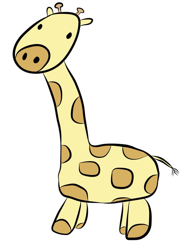
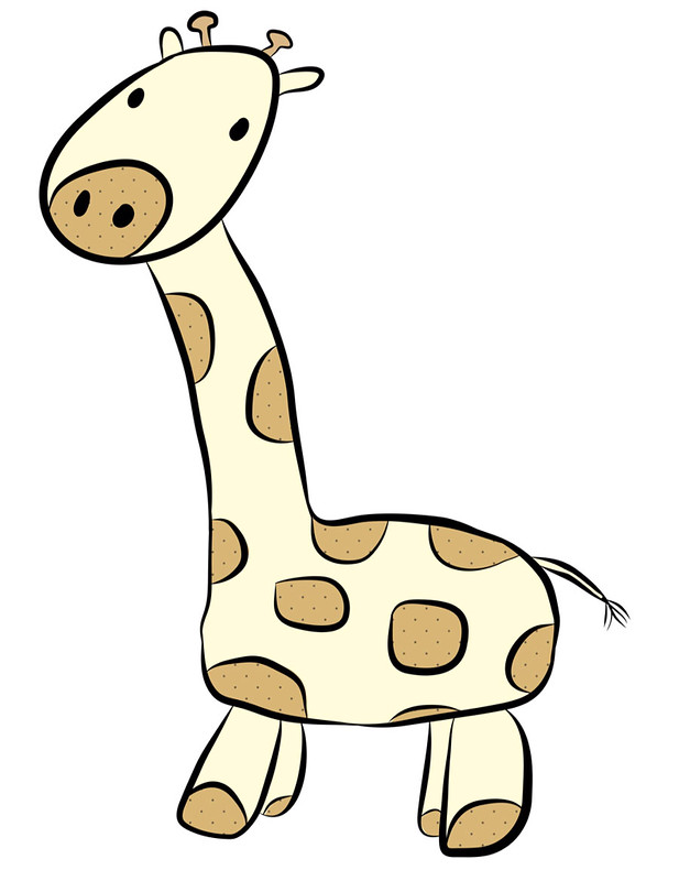
Since "Make Art That Sells" ended I've been giving Adobe Illustrator (Ai) a go. It is quite the challenging application but it can do so much. It's actually the perfect medium to play in with the little sketches that I do. While playing around I decided to utilize my iPad and use Adobe Ideas. This app is vector based (just like Ai) and you can share your "ideas" to Adobe Cloud and then download them into Ai.

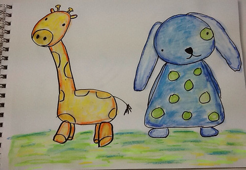
I found this photo from my sketchbook and traced the giraffe and then colored him in all on the app. When I downloaded the image into Ai I was able to correct all my mistakes and I can edit and manipulate it even more!


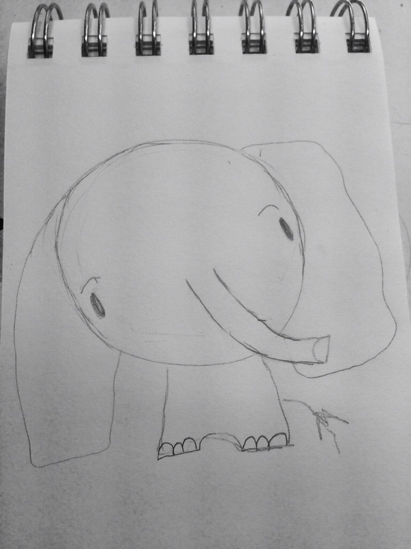
And here is a not so great photo from my mini sketch book.

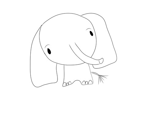
I traced it and played on my iPad.

And then I played a little in Ai.

I'm still getting the hang of everything and how the two programs work together. This has loads of potential that is super exciting for me. I can use my sketchbook and existing art in a whole new way! Things that I didn't see as having potential for a finished piece may work perfectly in this format. How fun!

Click here to read about the apps Adobe has for the iPad.

And if you don't have Illustrator you can try it here free for 30 days. It is not intuitive so, you would need to check out YouTube or Lynda.com for tutorials. I like Laura Coyle's YouTube channel.

Thanks so much for stopping by!


Tuesday, November 12, 2013

Diary of a "Make Art That Sells" Student: Weeks 3, 4 and 5 of Part B

Sorry I've been absent these past few weeks.  MATS Part B became very challenging for me and I also got sick so that didn't help.  Here are my projects for weeks' 3 through 5.

Week 3 was Scrapbooking week and I thought I was going to have an easy time with this one.  Nope. I found it quite difficult.  I think it was the subject matter, cameras and typewriters.  I don't normally draw objects.  I like characters better so I couldn't envision anything.  I also prefer the papers section of the Scrapbooking department and the focus was more on icons for stickers and embellishments for pages.  I don't go into that section.

I came up with these icons and used Illustrator to make the line drawings look cleaner.

Then I randomly chose 5 colored pencils to come up with a color scheme and played with layers in photoshop.


I think they look kind of cool but I'm not head over heals in love with this design  Below is the final presentation.  I tried to create "patterned paper" like you would find in a packet of paper.  I will likely revisit this and see if I can come up with something more interesting in the future.  


Week 4 was editorial and our mini was about lettering our town's name.  I had a sinking feeling the main assignment was going to be a map and I was right.  I had no clue how to do a map so, I decided to show the places you can take your kids in our area.  Morrisville has several parks and other interesting places to take your kids that you may not normally think of going.  Since the theme was "kid" oriented I took inspiration from Eric Carle and made a collage from painted paper.

My Icons


 My Final


I think its pretty good for a first try.  I love my boat, plane and firetruck.  I may need to use those for something else.

Our last week was Party Paper and the mini was all about Ukrainian or Bavarian Folk art.  Years ago I used to do craft painting and a lot of it was "folk art" style with swirls and flowers.  I was never a huge fan of that style but I went for it anyway.  I liked the Ukrainian better than the Bavarian.  I pulled out the paints and chose my favorite colors.  I even pulled out my special paint brushes that are often used just for "folk art painting".  They help the artist make flowers quickly.

These are my icons.


And this is my final presentation.


I really like how this came out.  It's bright and colorful and fun.  I think these icons can be used on lots of other things too.  I felt really good while I was creating this project (despite the fact that I was also sick with a horrid cough).  

Now the class is over and it's time to get motivated and get to work.  I know I am getting a better grasp of this licensing thing.  It's all about icons, icons, icons.  More importantly though it's about doing what you love.  I love to draw, paint, use bright colors and use characters in my work.  I think if I keep these things in mind when creating I will come up with a good collection.  I also have a really decent grasp of Photoshop.  I spent two days painting icons for my last project and two days on the computer assembling everything.  Who knew photoshop could be so helpful with art!  Stay tuned to see what happens next in my career!  Now, off to work!

Thanks for stopping by!

P.S.  More things will be added to my Etsy shop as well.  If you haven't visited yet, please stop by and check things out.


Monday, October 21, 2013

Diary of a "Make Art That Sells" Student: Week 2 of Part B

Well, it was another long, fun and hard working week for MATS!  Week 2 was all about Children's Apparel.  I have been shopping in the baby and children's departments for about 6 years now so, I was very excited for this week.  The theme was camping.  I really, really wanted to nail this one with a beautiful presentation.  That didn't happen.  I like my icons, especially the animal ones but I just can't get the arranging down to make it super pretty.  Getting the icons right is the most important thing though.  If those aren't strong I won't have a strong piece in the end.  Here is what I came up with.

This is the collections of icons I created.  I had to do woodland critters of course!  I drew the line work and the painting separately and put them together using Photoshop and Illustrator.  I used Illustrator for the line work then pasted it into Photoshop.


Coming up with arrangements was difficult.  I decided to create a scene with my icons and then I attempted a repeat like pattern with the critters.  It wasn't the success I hoped.  I also created a repeat with a painted mushroom which I think came out cute.


I am happy with the items I have to work with.  I really enjoyed this assignment and want to play more and more with it.  Here is the presentation sheet that I posted for review.


I'm going to get this eventually.  It's a big learning curve.  I am confident I can do this though! 

Week 3 is Scrapbooking!  I hope to continue improving!

Thanks for stopping by!


Monday, October 14, 2013

Diary of a "Make Art That Sells" Student: Week 1 of Part B

The second part of "Make Art That Sells" started last week and I buckled down, ignored housework, found sitters for the kids and got to work.  We got into the holiday spirit (before Halloween!) and had to create a Christmas card.  Lilla Rogers brings us into our assignment slowly by having us do a mini assignment before the big reveal of the main assignment later in the week.  I researched and sketched lots of different holiday ornaments and candy.  At this point I don't know if I'll be creating wrapping paper or a Christmas card collection. The big takeaway from this course is icons, icons, icons!  You need to make lots and lots and have a variety.  This is not the way I usually work.  I doodle and sometimes they turn into a painting.  The sketching process for licensing is very specific.  All the variety of icons may not make it into your final piece but they help you so much and they can be used for something else later so, they have loads of value.

I dove into my Christmas memories for inspiration.  My favorite ornament was one of an elf sitting on a mistletoe ball from my Grandma, candy canes, handmade ornaments and Christmas TV Specials.  When we got the main assignment of a Christmas Card I was ready and I had a concept.

These are my sketches and paintings for the assignment.


I knew I wanted an elf so, I decided she was going to decorate a very challenging tree.  I knew I wanted her dress to have a pattern so, I made a candy cane one in Photoshop.  
(Check out my tutorials here and here)


Then I tried coloring my sketch of the elf in Photoshop.  The results were cute but I decided to go with traditional media.


Then I realized I needed to tilt her head because the tree was going to be little.  So, I cut and played in Photoshop instead of redrawing the elf.


Next came the ornaments that I envisioned spilling from her box.


This was the first draft of the card.


I wasn't thrilled and then the idea of a winter scene popped into my head.  But, there was even more.  I imagined this card as a novelty card.  You would open it up and the elf transforms the Charlie Brown inspired tree into a big beautiful tree.  The elf had to change on the inside too.  Instead of drawing a new elf I decided to make the parts I needed and do some Photoshop magic.


This is the draft I submitted.  The card cover nice and big on the presentation sheet and a decorated tree with a joyful elf for the interior of the card underneath.  I even managed some hand lettering on the cover of the card inspired by the curlz font.  If I had more time I would've hand lettered the inside text but, I ran out of time.  It was very important to me to have the concept presented.  


A few months ago I never would've attempted something like this.  I used Photoshop and Illustrator for this.  I wish I had dived into the programs more between Part A and Part B of this course but I am proud of what I was able to accomplish.  

This week we are doing Baby/Children's Apparel.  I've been shopping in those departments for years now.  I think this week will be fun!  Please check back next week to read the next installment of my diary.

Thanks for stopping by!