Monday, October 21, 2013

Diary of a "Make Art That Sells" Student: Week 2 of Part B

Well, it was another long, fun and hard working week for MATS!  Week 2 was all about Children's Apparel.  I have been shopping in the baby and children's departments for about 6 years now so, I was very excited for this week.  The theme was camping.  I really, really wanted to nail this one with a beautiful presentation.  That didn't happen.  I like my icons, especially the animal ones but I just can't get the arranging down to make it super pretty.  Getting the icons right is the most important thing though.  If those aren't strong I won't have a strong piece in the end.  Here is what I came up with.

This is the collections of icons I created.  I had to do woodland critters of course!  I drew the line work and the painting separately and put them together using Photoshop and Illustrator.  I used Illustrator for the line work then pasted it into Photoshop.


Coming up with arrangements was difficult.  I decided to create a scene with my icons and then I attempted a repeat like pattern with the critters.  It wasn't the success I hoped.  I also created a repeat with a painted mushroom which I think came out cute.


I am happy with the items I have to work with.  I really enjoyed this assignment and want to play more and more with it.  Here is the presentation sheet that I posted for review.


I'm going to get this eventually.  It's a big learning curve.  I am confident I can do this though! 

Week 3 is Scrapbooking!  I hope to continue improving!

Thanks for stopping by!


Monday, October 14, 2013

Diary of a "Make Art That Sells" Student: Week 1 of Part B

The second part of "Make Art That Sells" started last week and I buckled down, ignored housework, found sitters for the kids and got to work.  We got into the holiday spirit (before Halloween!) and had to create a Christmas card.  Lilla Rogers brings us into our assignment slowly by having us do a mini assignment before the big reveal of the main assignment later in the week.  I researched and sketched lots of different holiday ornaments and candy.  At this point I don't know if I'll be creating wrapping paper or a Christmas card collection. The big takeaway from this course is icons, icons, icons!  You need to make lots and lots and have a variety.  This is not the way I usually work.  I doodle and sometimes they turn into a painting.  The sketching process for licensing is very specific.  All the variety of icons may not make it into your final piece but they help you so much and they can be used for something else later so, they have loads of value.

I dove into my Christmas memories for inspiration.  My favorite ornament was one of an elf sitting on a mistletoe ball from my Grandma, candy canes, handmade ornaments and Christmas TV Specials.  When we got the main assignment of a Christmas Card I was ready and I had a concept.

These are my sketches and paintings for the assignment.


I knew I wanted an elf so, I decided she was going to decorate a very challenging tree.  I knew I wanted her dress to have a pattern so, I made a candy cane one in Photoshop.  
(Check out my tutorials here and here)


Then I tried coloring my sketch of the elf in Photoshop.  The results were cute but I decided to go with traditional media.


Then I realized I needed to tilt her head because the tree was going to be little.  So, I cut and played in Photoshop instead of redrawing the elf.


Next came the ornaments that I envisioned spilling from her box.


This was the first draft of the card.


I wasn't thrilled and then the idea of a winter scene popped into my head.  But, there was even more.  I imagined this card as a novelty card.  You would open it up and the elf transforms the Charlie Brown inspired tree into a big beautiful tree.  The elf had to change on the inside too.  Instead of drawing a new elf I decided to make the parts I needed and do some Photoshop magic.


This is the draft I submitted.  The card cover nice and big on the presentation sheet and a decorated tree with a joyful elf for the interior of the card underneath.  I even managed some hand lettering on the cover of the card inspired by the curlz font.  If I had more time I would've hand lettered the inside text but, I ran out of time.  It was very important to me to have the concept presented.  


A few months ago I never would've attempted something like this.  I used Photoshop and Illustrator for this.  I wish I had dived into the programs more between Part A and Part B of this course but I am proud of what I was able to accomplish.  

This week we are doing Baby/Children's Apparel.  I've been shopping in those departments for years now.  I think this week will be fun!  Please check back next week to read the next installment of my diary.

Thanks for stopping by!


Monday, October 7, 2013

Making a Repeat Pattern in Photoshop CS6 Part 2

As promised here is part 2 of the Photoshop Tutorial.  (See Part 1 here)
 I took lots of screenshots with instructional notes.  I hope it is easy to follow! 

First you need to create a square to put your icons in. 


Then I create guides to help me.


Next you want to convert your icons to Smart Objects.  This is super important.  If you shrink an object that is not a Smart Object and then make it larger again it looses information.  Arranging icons for a repeat requires a lot of sizing up and down to get things just right so, convert to Smart Object.


A resizing tip: hold the Shift Key down as you resize the image from the corner of the Move Tool bounding box.  Another tip for dealing with Layers: Make sure the Auto-Select box is checked on your tool bar.  When you click on an icon the Layer is automatically selected.


When you "Save As" your icon arrangement Save it as a Photoshop File so your don't loose your layers!

When I merge my Layers I use Merge Visible to flatten them..


Now you can define your pattern!


Now you are ready to test your pattern.  Choose File > New > U.S. Paper > Letter

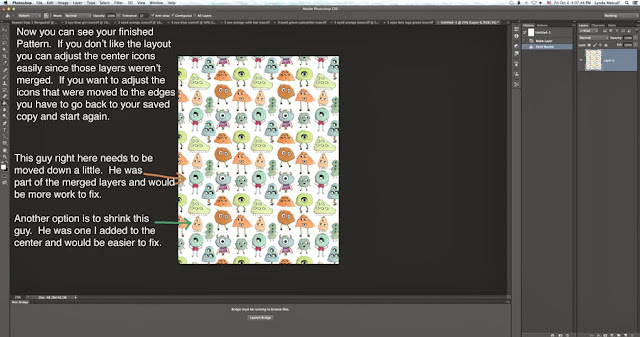
You will unlock your layer and fill it with your pattern using the Paint Bucket tool.  It looks like a bucket with stuff spilling out.  Make sure it is set to Pattern in your toolbar.  Choose your pattern (it'll be the last one in the group)


You can try different colored backgrounds for your patterns too (also called colorways).  Below is how I do it.  Make a new Layer then click the half filled circle symbol to create a fill layer.  

After I choose the color I want my background to be I make another new Layer and use the Paint Bucket to fill it with my pattern.


You can keep changing your colored layer and then choose "Save As" when you have a colorway you like.


Don't forget after playing to "Save As" your pattern as a Photoshop file.


This is one I did earlier with a different monster arrangement.

Phew.  That's a lot of steps but it comes out so darn cute!  I came up with this method from things 
I found online.  I tried to make my version as visual as possible with notes by all the little things some tutorials seem to forget.  Here is a link to making a hand drawn repeat pattern you can scan into your computer.  I think checking this out will help you understand the Offset I did.

When I have time in the near future I will send some patterns off to Spoonflower and show how they came out.  I don't know what I'll do with the fabric since I can't sew....

Over the next 5 weeks I am going to be knee deep in Make Art That Sells Part B.  I am considering writing diary style blog posts of my experience so, stay tuned!

Thanks for stopping by!

P.S. These same steps will work in Photoshop Elements!  I checked and the Filter Tab has the Offset choice.  Filter > Other > Offset


Wednesday, October 2, 2013

Snapshots From My Studio

I hang lots of things on my walls in my studio. My art, sketches, art from other artists. It inspires me. I use it for reference. It helps me remember ideas I want to try. 


Thanks for stopping by!